WEBSITE
TICKET MANAGEMENT
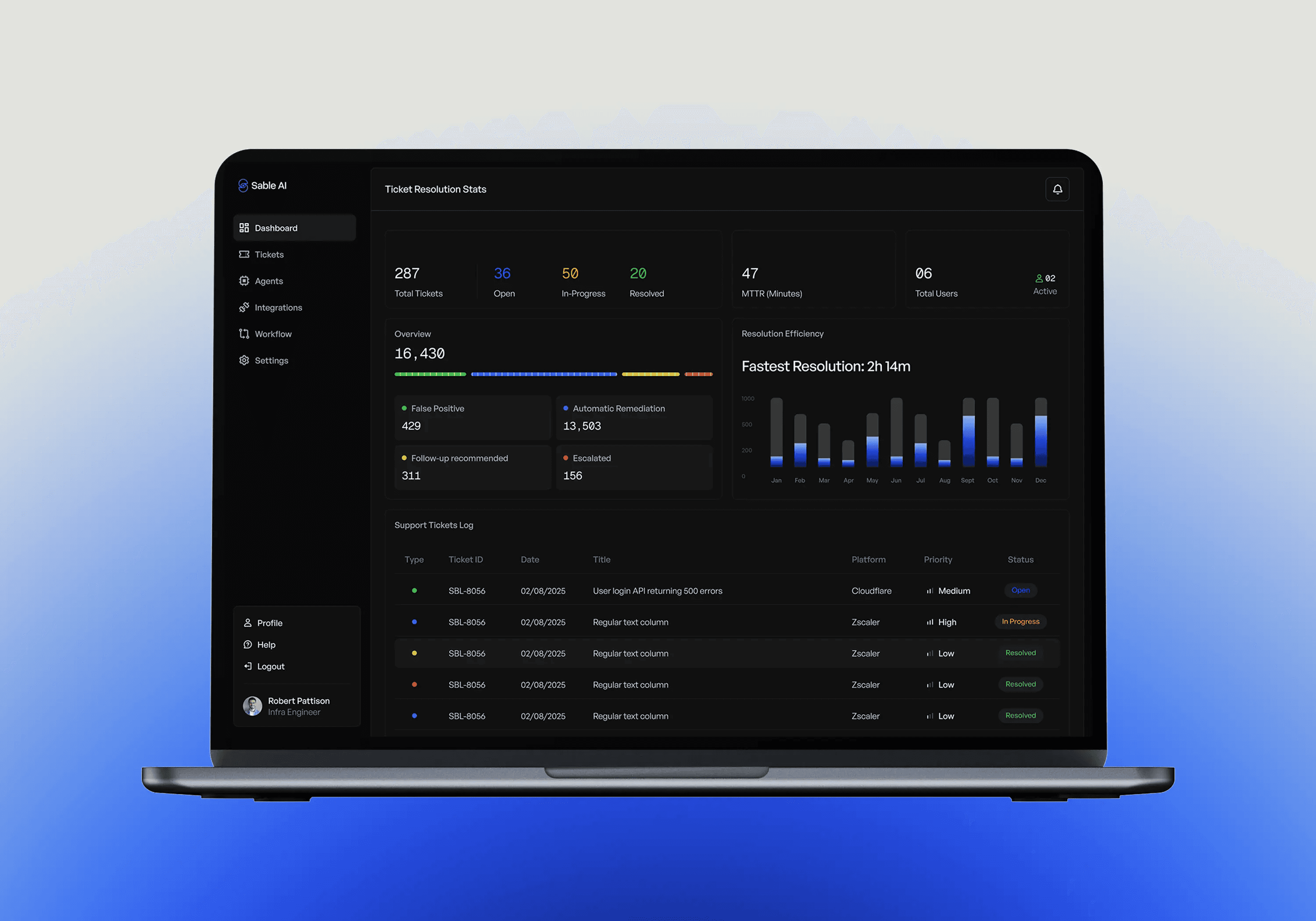
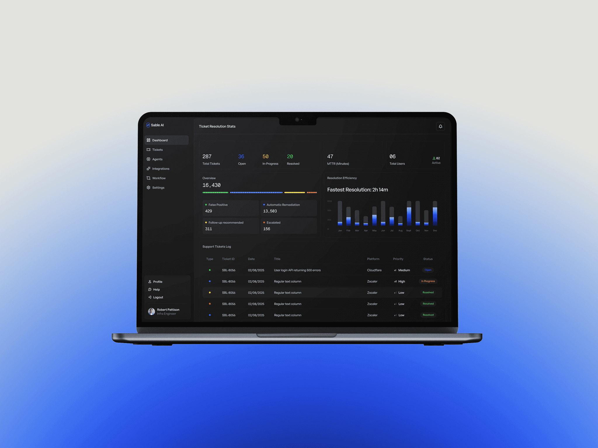
A conversion page designed for an AI ticket management platform.
A landing page built to establish visual identity and drive acquisition for an AI-native ticket management platform
My Role
Product Designer
Platform
Website + WebApp
Timeline
~1 week

The product had no visual identity. It needed one before it could go public.
Sable AI was approaching launch with an existing user base but no brand presence and no design system. The website was the first designed surface. The goal was simple: establish a credible, modern aesthetic for an AI-native security product and convert visitors into demo requests.
The visual direction came from the product's own logic. A ticket management platform that operates at machine speed needed an aesthetic that felt precise, capable, and distinctly AI-native, not the flat blues of a typical SaaS dashboard. The dark treatment and the glowing funnel illustration were the answer to that question
The design had to communicate an AI-native, autonomous security product to a B2B buyer, without feature depth to lean on, without metrics to anchor credibility, and without a working brief. The brand had to do the work the product information couldn't.
WEBSITE
WEBSITE
A management product needed a face. This was it.
Security products are notoriously hard to communicate. The buyer is a technical decision-maker, a SecOps lead or an IT manager who is skeptical of vague AI claims and evaluates products on clarity and credibility. At the same time, the product had limited public information to offer. No case studies, no benchmarks, no pricing, no feature depth.
The website needed to earn trust and prompt a demo request from a visitor who might arrive with no prior context. The design approach was to demonstrate the product's core logic, not describe it. Show the system thinking, not a list of features.
The system wasn't built to document what existed, it was built to scale what would be built next. Finas was the first product. The three that followed didn't need to establish their own visual language. They inherited one. That's the compounding value of a design system scoped beyond the immediate brief.
The Funnel
The Funnel
The core visual concept was built around the product's own logic. Four stages: ingest, normalise, decide, output were translated into a vertical funnel illustration, designed to make the AI pipeline readable without requiring technical literacy
The original intent was scroll-driven. Each stage would occupy a full viewport, revealing itself as the user scrolled, one step at a time, mirroring how the system actually processes a ticket. The goal was connection: a visitor experiencing the product's logic sequentially, not scanning a diagram

The client wanted it compressed into a single viewport. The argument was legibility, everything visible at once, nothing hidden behind a scroll. Multiple rounds of iteration and rationale didn't shift the position. A middle ground was reached: the funnel was shortened but split across two scroll positions, preserving some of the progressive reveal without the full immersive sequence.


Brand Direction
Brand Direction
A dark-with-mixed-sections treatment was chosen over a fully dark or fully light site. The glowing funnel visual required depth and contrast to read a light background would have flattened it. Mixed sections allowed breathing room in content-heavy areas while preserving the visual atmosphere in the hero and flow sections. The tone is deliberate: AI-native, precise, not enterprise-generic.
The funnel visual
The funnel visual
The product's core logic, "ingest, normalise, analyse, decide" was translated into a vertical funnel illustration. The intent was to make the AI pipeline readable in a single glance, without requiring technical literacy. Security tools are commonly explained through static diagrams or text-heavy feature lists. A glowing, layered visual that shows data flowing through the system was a deliberate departure from that convention.
Iteration: scroll vs viewport
An early direction explored a scroll-driven experience one pipeline stage per viewport, revealed progressively as the user scrolled. The rationale was immersion: letting visitors experience the AI process step by step, mirroring how the system actually works. The client preferred the full funnel visible at once, prioritising comprehension over experience. The final design compressed the stages into a single contained visual. The scroll-driven direction remains the stronger call for engagement; the shipped version prioritised legibility.
The page was handed off but never developed as designed. The prototype reflects the original intent.